themeColor | Color | Specifies the theme color to match the app’s style | Colors.black |
daySelectedColor | Color | Specifies the selected day color. | Colors.grey |
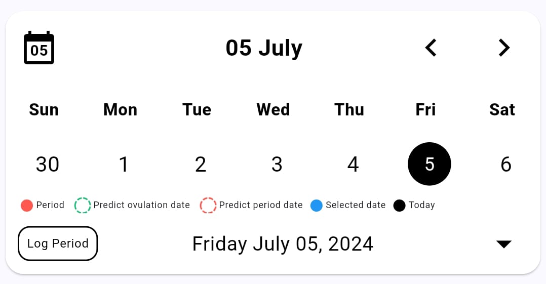
hideInfoView | bool | Set true to hide information view. | false |
onDataChanged | Function | Callback this function if change any data into calender view. | - |
isShowCloseIcon | bool | Set true to show (X) close icon on top left side of calender view. | false |
onDataSelected | Function | Callback this function if select any date into calender view. | - |
isExpanded | bool | Set true to show full month calender view. | false |
hideBottomBar | bool | Set true to hide bottom bar of calender view | false |
hideLogPeriodButton | bool | Set true to hide button of "Log Period". | false |
logPeriodText | String | Specify the text of log period button. | Log Period |
backgroundColorCode | Color | Specify the background color of calender view | Colors.white |